Project Overview
This project analyzes mobile app behavior using Tableau, focusing on popularity, engagement patterns, weekly usage trends, and user interaction styles. Multiple visualizations were used to understand how people spend time across different apps and categories.
📊 View Live Dashboard on Tableau PublicVisualization Types Used
- Bar charts for direct app comparisons
- Heatmaps for behavioral patterns across time
- Donut charts for usage distribution
- Scatter plots with regression for correlation analysis
Data Analysis Approach
Different chart types were selected based on analytical goals:
Chart selection rationale: Bar charts compare apps directly, while heatmaps and scatter plots reveal behavioral patterns across time and categories.
App Popularity & Engagement
Top Apps by Metric
Best performers: Apps performing strongly across all metrics include Spotify, WhatsApp, and YouTube.
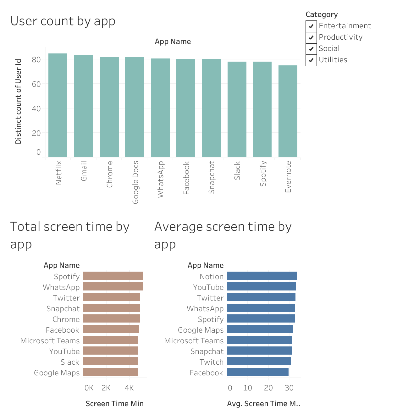
Bar chart comparison of app popularity and engagement metrics
Weekly Screen Time Patterns
Screen time increases toward the end of the week, with Saturday showing the highest usage.
Category Behavior by Day
Key insight: App usage follows real-life weekly routines — work during weekdays, entertainment on weekends.
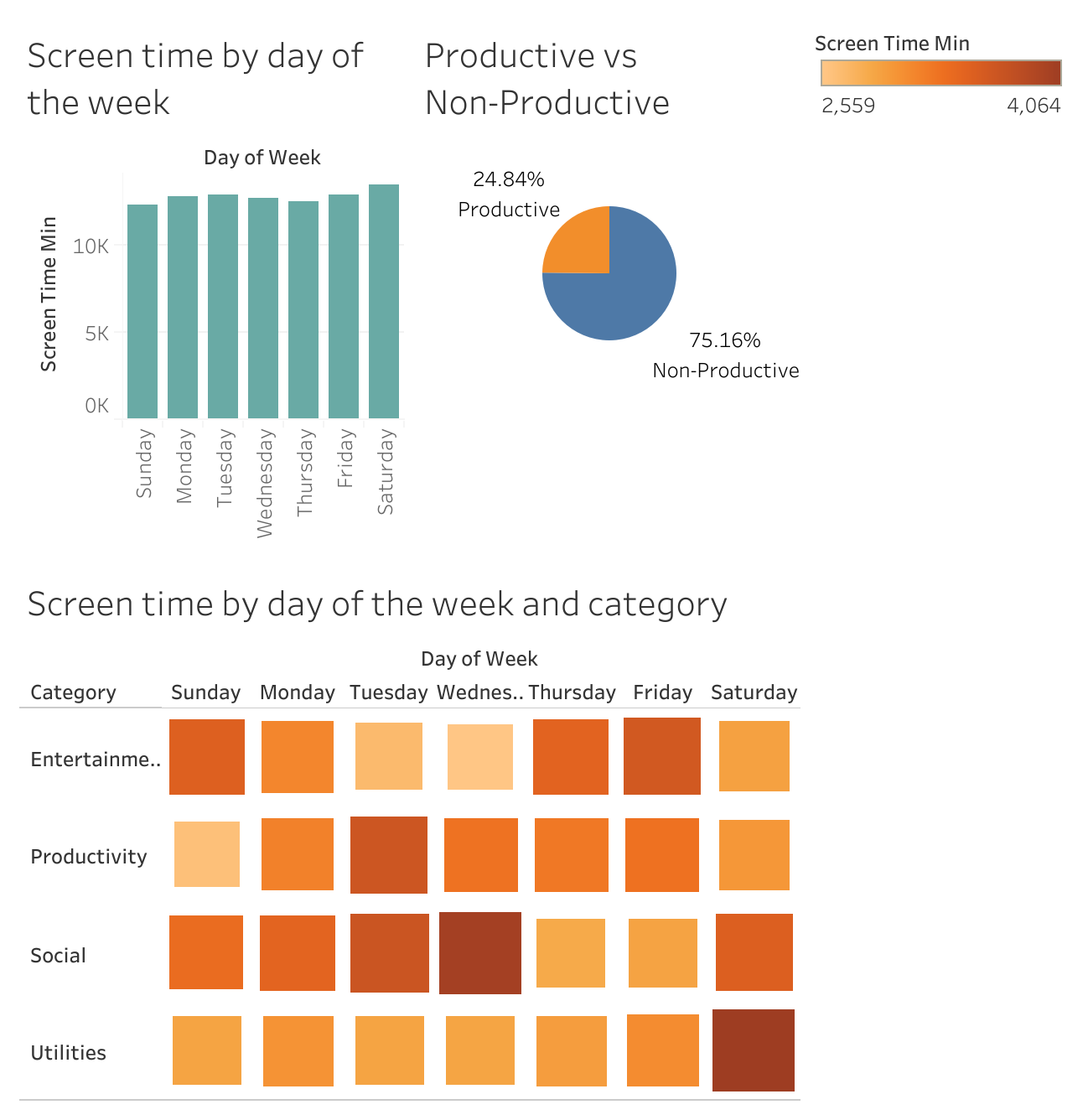
Heatmap showing screen time distribution across days and categories
Productive vs Non-Productive Usage
Reality check: Entertainment and social apps dominate overall attention, highlighting the challenge of maintaining productive screen time.
Launches vs Screen Time Behavior
Scatter plot regression shows no strong relationship between app launches and screen time:
Statistical finding: Opening apps more often does not mean longer usage time. The relationship is statistically insignificant.
Behavioral Patterns Identified
⏱️ Long-Session Apps
Fewer launches but longer sessions per use
⚡ Quick-Check Apps
Frequent launches but short sessions
Notable pattern: Netflix shows binge-style behavior — long sessions with low launch frequency.
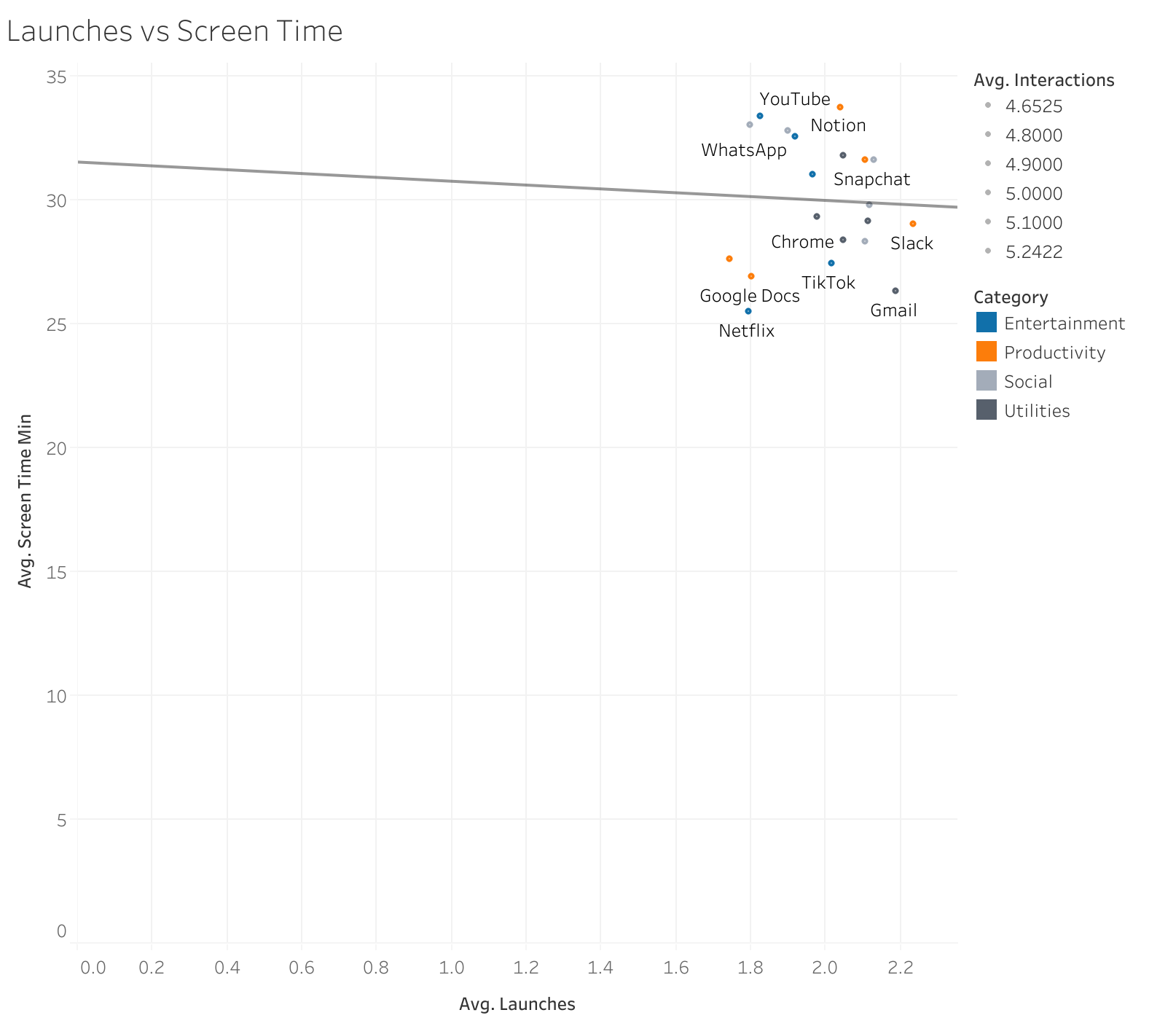
Scatter plot with trend line showing weak correlation between launches and screen time
Tools & Techniques
Key Insights
📱 App Reach ≠ Engagement
High user count doesn't guarantee high engagement. Notion has fewer users but highest engagement per user.
📅 Weekly Routines Matter
App usage follows predictable weekly patterns — productivity mid-week, entertainment on weekends.
⏱️ Two Usage Styles
Users exhibit either "long-session" or "quick-check" behavior depending on app type.
🎯 Entertainment Dominates
75% of screen time is non-productive, highlighting the attention economy's pull.